Logos are a huge part of a team’s identity, and in the NBA, they range from iconic to forgettable. Some perfectly capture the spirit of a franchise, while others feel uninspired, outdated, or just plain dull.
Here’s our ranking of all 30 NBA logos, from the ones that miss the mark to the absolute best in the league.
30. Los Angeles Clippers
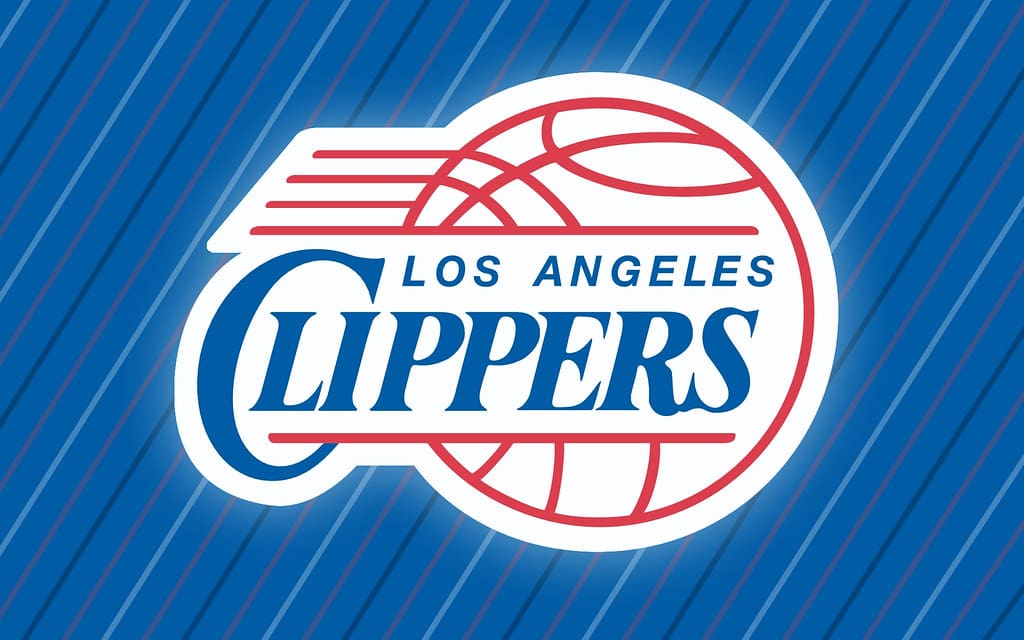
The Clippers’ logo is about as generic as they come. It lacks creativity, personality, or any real connection to the team’s identity. It feels more like a placeholder than a symbol of a franchise.
29. Washington Wizards

The Wizards ditched their magical theme years ago, but their current logo is still a mess. While the red, white, and blue color scheme fits the nation’s capital, it’s cluttered, lacks energy, and completely ignores the “Wizard” theme.
28. Sacramento Kings

The Kings’ logo is an improvement over past versions, but its sharp, geometric look feels more like a corporate brand than a sports team. The crown is a nice touch, but overall, it’s just not that exciting.
27. Detroit Pistons
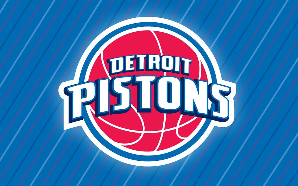
The Pistons’ logo isn’t terrible, but it doesn’t stand out either. While it nods to the team’s history, it lacks the gritty, blue-collar feel that should define Detroit basketball.
26. New Orleans Pelicans
This logo is way too busy. The color scheme is awkward, and the design feels more like a tourism logo than an intimidating basketball emblem. A pelican can be a cool mascot, but this execution misses the mark.
25. Orlando Magic
The Magic’s logo still feels like it’s stuck in the ‘90s. The shooting star is fun, but the overall design could use a modernization to give it more energy and movement.
24. Cleveland Cavaliers
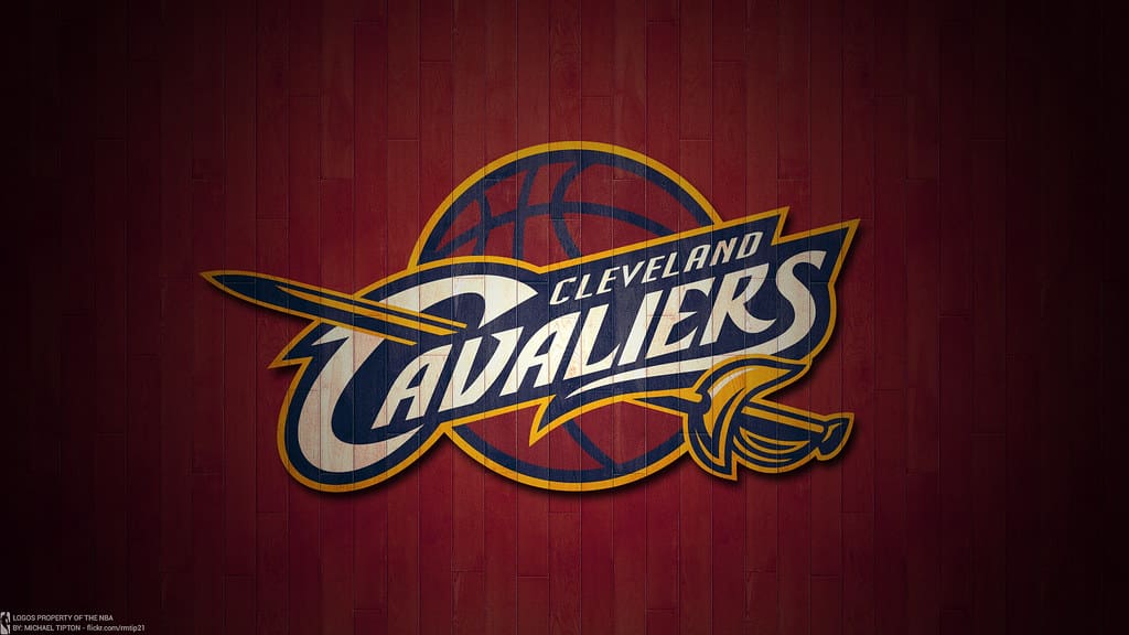
The Cavs’ sword-and-shield theme is solid in theory, but the execution is underwhelming. The gold-on-black design looks sleek, but it lacks the boldness of some of the league’s better logos.
23. Memphis Grizzlies

The Grizzlies’ logo has personality, but it feels caught between being intimidating and looking like a cartoon. The bear’s glowing eyes are a cool touch, but the overall design lacks the sleekness of the NBA’s best.
22. Phoenix Suns
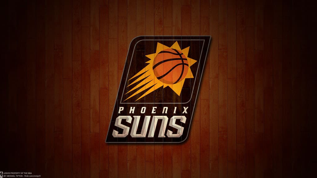
The Suns’ bright colors and sunburst basketball are nice, but this logo doesn’t fully capture the essence of Phoenix or its desert roots. It’s an okay design, but there was potential for something more dynamic.
21. Indiana Pacers
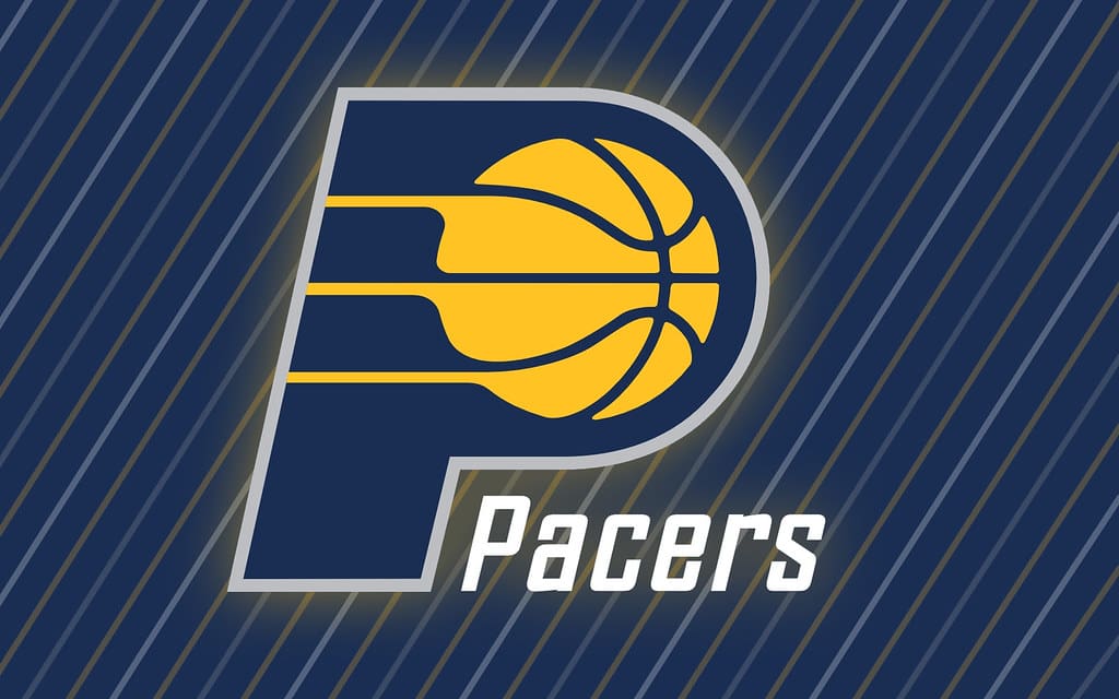
The Pacers’ logo has barely changed over the years, which makes it classic but also a little boring. The “P” with a basketball in motion is simple, but it doesn’t really pop.
20. Minnesota Timberwolves

The Timberwolves’ logo has a cool wolf-and-moon concept, but the colors are a bit muted. It’s a decent design that could be elevated with a little more contrast and vibrancy.
19. Denver Nuggets

The pickaxes are a nice nod to Denver’s mining history, but the overall design is a bit safe. It’s a solid, well-balanced logo, but it doesn’t take any risks.
18. Charlotte Hornets

The Hornets’ modern redesign looks sharp, with bold lines and a fierce-looking hornet. However, it still feels like it could use a little extra personality to truly stand out.
17. Atlanta Hawks
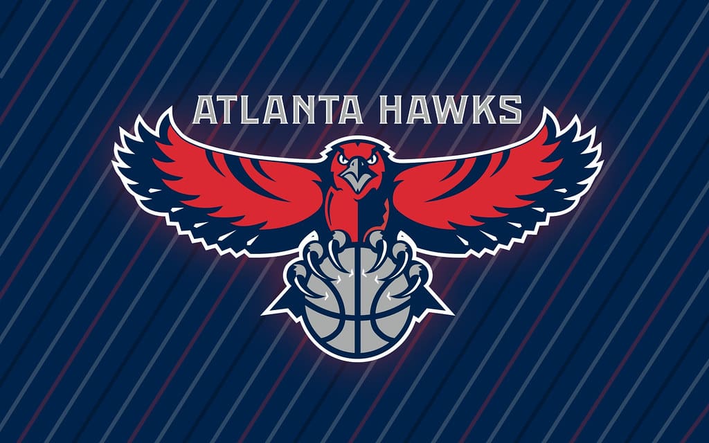
The Hawks’ logo is sleek and modern, but it doesn’t quite have the “wow” factor of the league’s best. The return to the red-and-white pac-man design is a step in the right direction, though.
16. Houston Rockets

The Rockets’ logo features a clever “R” that doubles as a rocket launching, but the rest of the design feels a little dated. A refresh could better capture the team’s fast-paced style.
15. Milwaukee Bucks
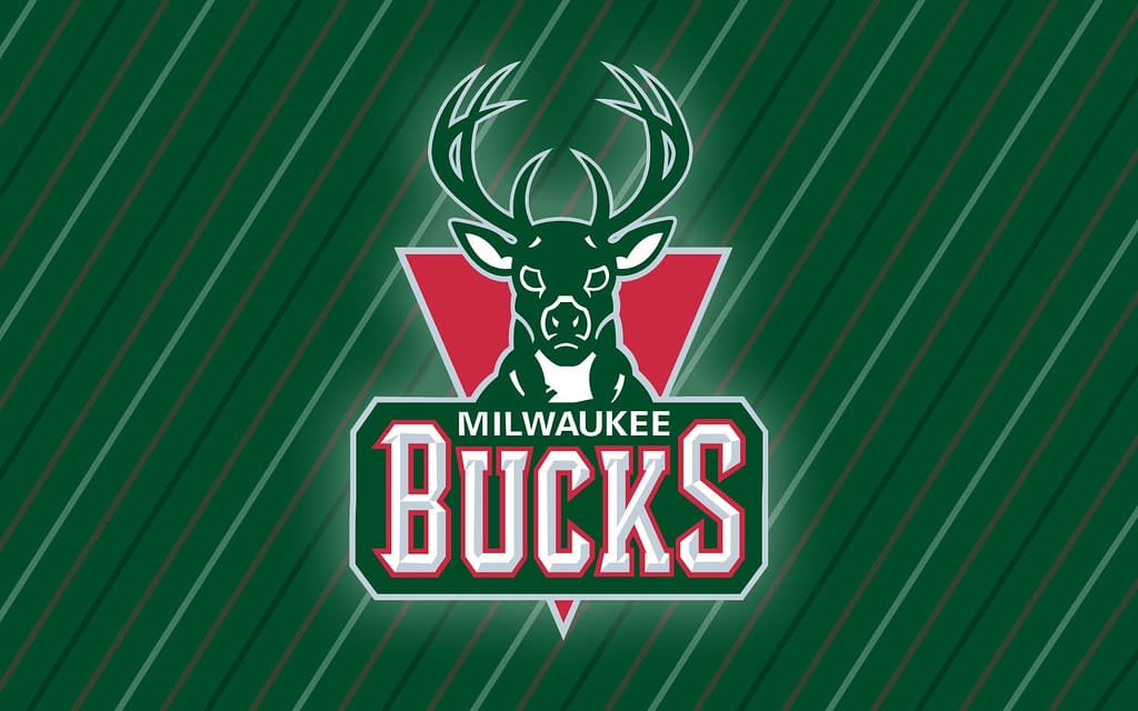
This is a strong, modern redesign that features a powerful buck front and center. It’s well-executed, but it doesn’t have quite the same instant recognizability as some of the NBA’s truly iconic logos.
14. Oklahoma City Thunder

OKC’s logo has been criticized for being a bit generic, and while that’s fair, its unique color scheme and lightning bolt elements give it some character. Still, it could use a redesign to better reflect the team’s identity.
13. Brooklyn Nets
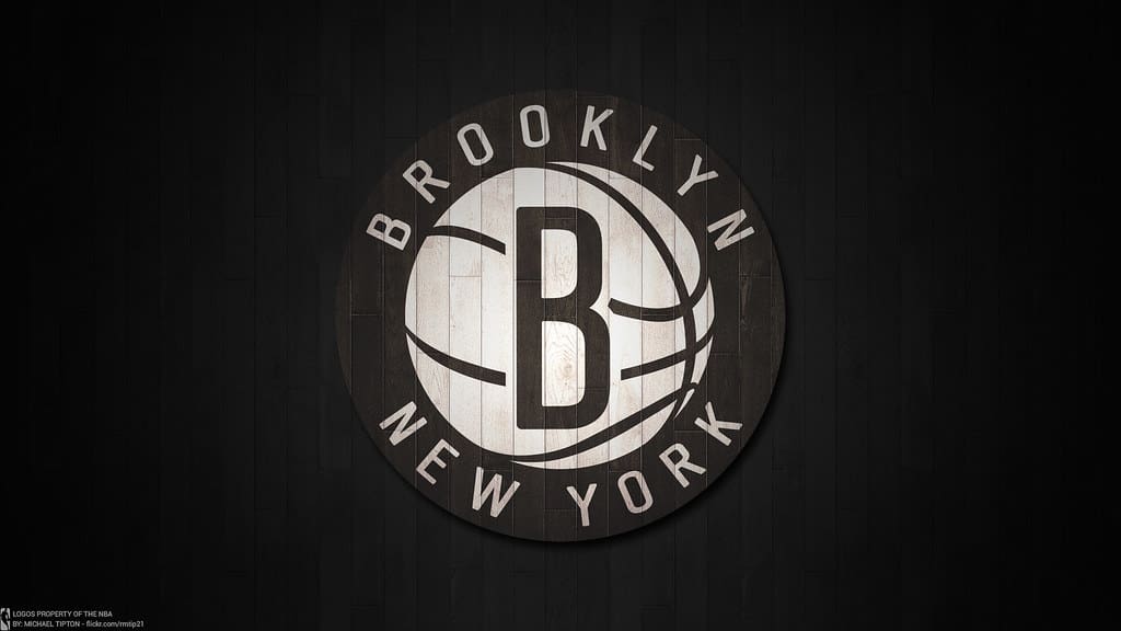
The Nets’ minimalist black-and-white logo is as sleek as they come. Some might call it basic, but there’s something effortlessly cool about its simplicity.
12. San Antonio Spurs

The Spurs’ logo cleverly incorporates a spur into the team’s name, and it’s one of the few logos that feels iconic without being over-the-top. It’s clean, simple, and effective.
11. Philadelphia 76ers

The 76ers’ logo perfectly represents the team’s historic ties to America’s founding. It’s not flashy, but its classic basketball-and-stars design is instantly recognizable.
10. Boston Celtics
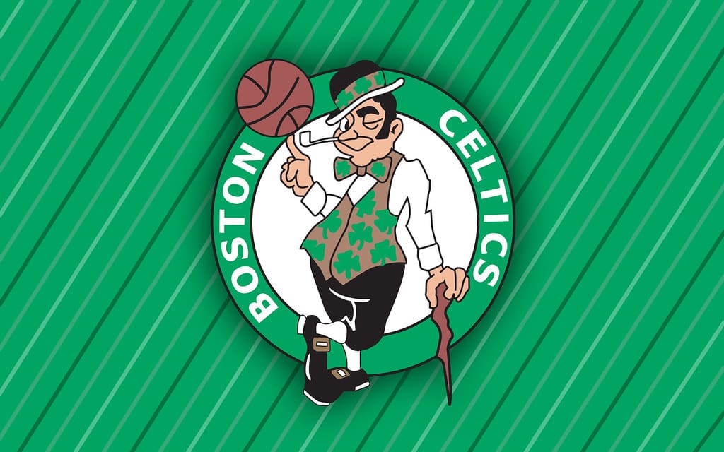
The Celtics’ leprechaun logo is full of personality and has a timeless charm. While it may feel a little dated compared to modern designs, its distinct character makes it a staple of NBA branding.
9. Toronto Raptors
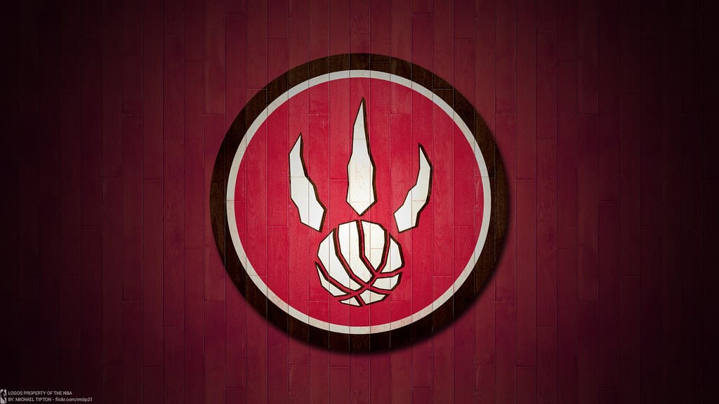
The Raptors’ clawed basketball logo is a great mix of simplicity and aggression. It’s modern, clean, and perfectly fits the team’s identity.
8. Chicago Bulls

Few logos are as instantly recognizable as the Bulls’ red-and-black bull head. It’s simple yet fierce, and it’s forever associated with Michael Jordan’s dynasty.
7. Los Angeles Lakers

The Lakers’ logo isn’t particularly flashy, but its purple-and-gold color scheme is iconic. It’s a perfect representation of the team’s rich history and dominance.
6. Miami Heat
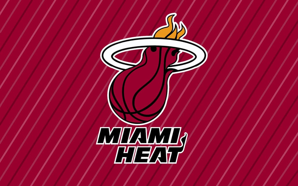
The flaming basketball is a perfect metaphor for Miami’s intense energy. It’s dynamic, stylish, and instantly conveys the team’s identity.
5. Dallas Mavericks
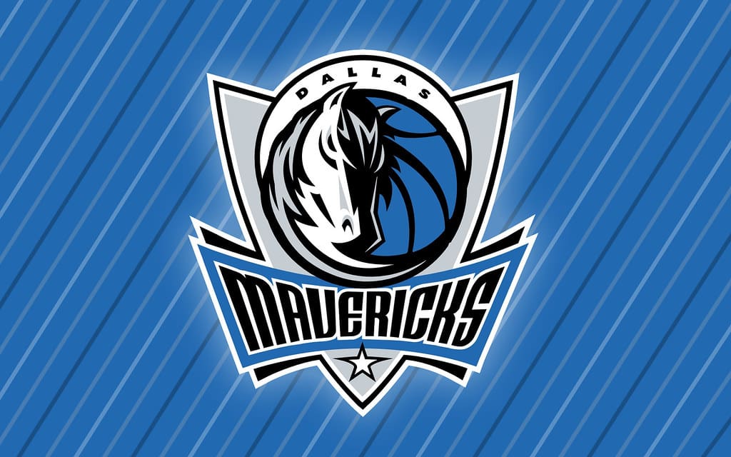
The Mavericks’ horse-and-basketball design is bold and modern, giving the team a distinct, fresh look. It stands out without being overcomplicated.
4. Portland Trail Blazers

The Blazers’ pinwheel logo is a masterclass in abstract design. It’s simple yet meaningful, representing both the movement of a basketball game and the team’s unique identity.
3. Golden State Warriors
The Warriors’ bridge logo perfectly represents the Bay Area while keeping the design clean and bold. It’s a fantastic mix of local pride and sleek aesthetics.
2. Utah Jazz

The Jazz’s music-themed logo has gone through several updates, but the modern version is a perfect balance of tradition and innovation. The musical note and basketball combination make it one of the most unique logos in sports.
Read More: The 10 Most Legendary Formula One Cars Ever
1. New York Knicks

The Knicks’ logo has remained largely unchanged for decades, and for good reason. Its retro-modern look, bold lettering, and basketball design perfectly capture the energy of New York City. Love them or hate them, the Knicks have one of the most recognizable logos in all of sports.
Read More: Ranking the Top NBA Video Games Of All Time