Baseball is a sport built on nostalgia. While modern uniforms have their place, some teams had absolute gems in the past that deserve a comeback. Whether it’s bold colors, funky fonts, or just pure 70s and 80s greatness, these classic uniforms need to make a full-time return.
Here are 15 MLB teams that should seriously consider bringing back their old-school uniforms—because sometimes, the past just looks better.
15. New York Mets (1980s Racing Stripes)
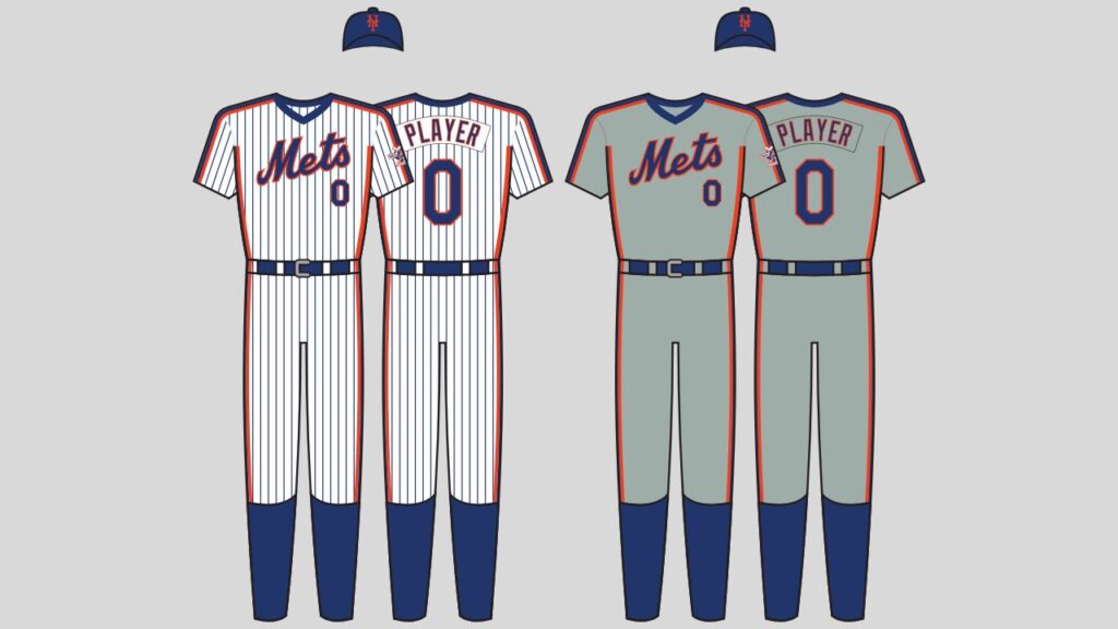
The 1980s Mets were chaotic, controversial, and really good—and their uniforms matched the vibe perfectly. The racing stripes down the sides gave them a unique, aggressive look. Plus, anything that reminds people of the ‘86 Mets (without the off-field madness) is a win.
14. Houston Astros (Rainbow Jerseys)

The Astros’ tequila sunrise jerseys were so bold they shouldn’t work—but they absolutely do. These vibrant uniforms scream peak 70s, and while Houston wears them as throwbacks now, they deserve a full-time spot in the rotation.
13. Milwaukee Brewers (Ball-in-Glove Logo Era)
The Brewers finally brought back their ball-in-glove logo, but they still haven’t fully committed to the baby blue and yellow look from the 80s. It’s easily one of the best uniforms in MLB history. Time to stop messing around and bring them back for good.
12. Pittsburgh Pirates (Black and Gold “We Are Family” Jerseys)
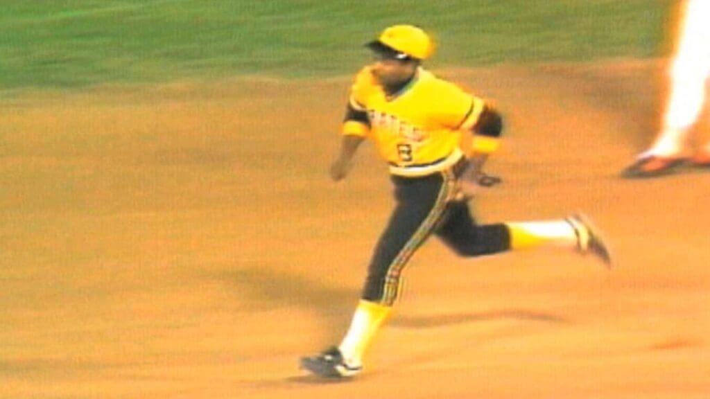
The late 70s Pirates were a force, and their bold black and gold uniforms made a statement. The mix-and-match combos with the pillbox hats were legendary. Today’s Pirates could use a little bit of that swagger again.
11. Toronto Blue Jays (Early 90s Look)
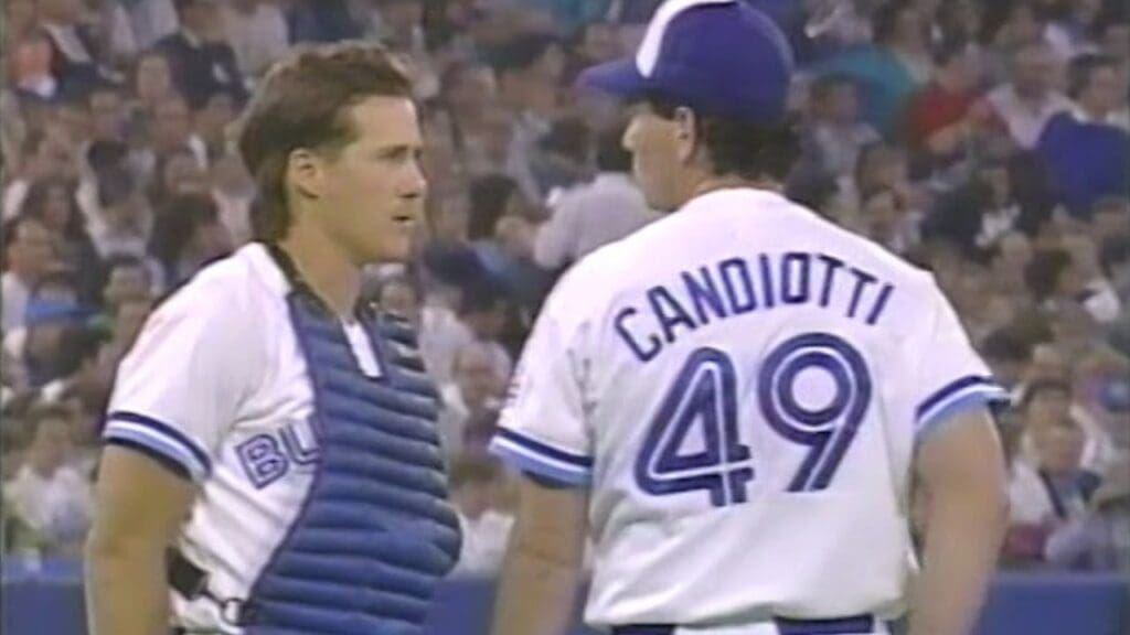
The Blue Jays had an elite uniform setup in the early 90s. The crisp blue and white jerseys with the classic bird logo (before they started messing with it too much) just look like winners—probably because they won back-to-back World Series in them.
10. San Diego Padres (Brown and Yellow 1980s Look)
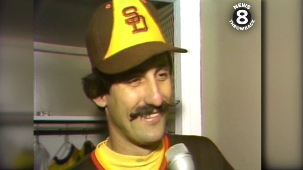
The Padres finally embraced brown again, but they still haven’t fully brought back the best version—the yellow-heavy, taco stand greatness from the 80s. The brown pinstripes and bold yellow lettering were peak retro baseball.
9. Seattle Mariners (Trident Logo Era)
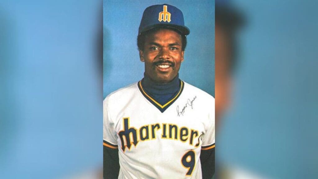
The Mariners’ 70s trident logo was perfect. It had a cool, clean look, and the gold and royal blue color scheme popped. It’s so much better than the generic navy look they have now. Bring it back full-time.
8. St. Louis Cardinals (Powder Blues)
The Cardinals have one of the best home looks in baseball, but their powder blue road uniforms from the 80s are next level. They’ve brought them back as alternates, but they should be the go-to road uniforms again—because they’re that good.
7. Texas Rangers (Baby Blue 1970s Jerseys)
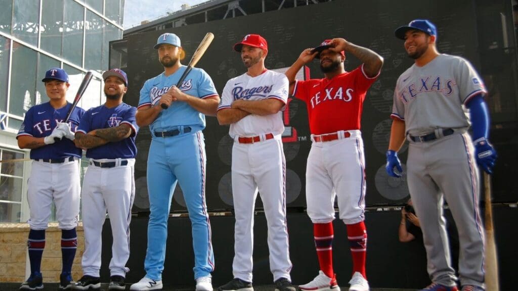
The Rangers’ current uniforms are fine, but their 70s powder blue and red combo is elite. They looked bold, clean, and unique—way more interesting than their current safe choices. More baby blue, fewer boring designs, please.
6. Oakland Athletics (Kelly Green 70s Look)
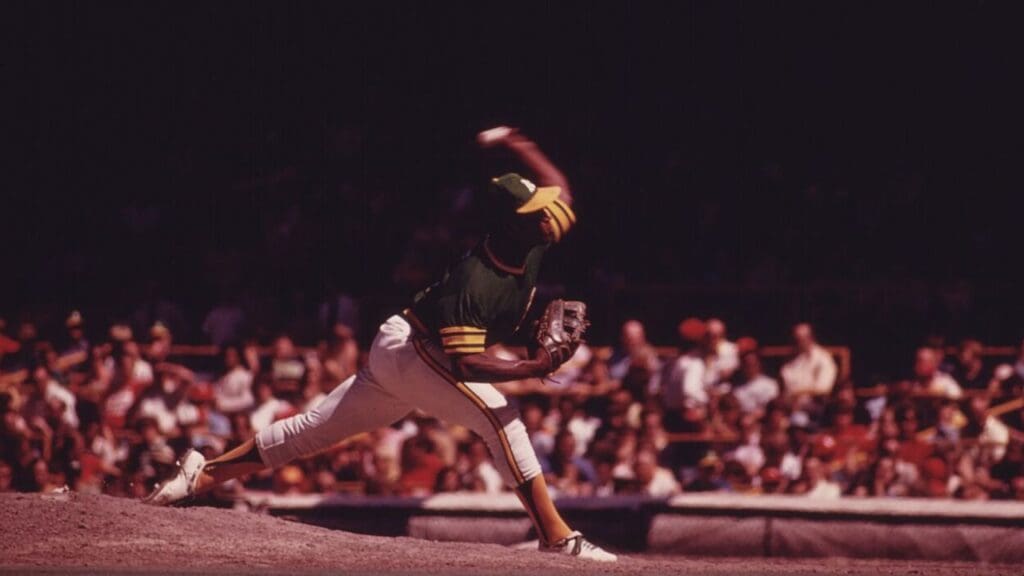
The A’s have some of the best color schemes in baseball, but their late 70s bright kelly green jerseys were the look. They’ve embraced the color again, but the throwback font and style need to return permanently.
5. Minnesota Twins (Baby Blue Pinstripes from the 80s)
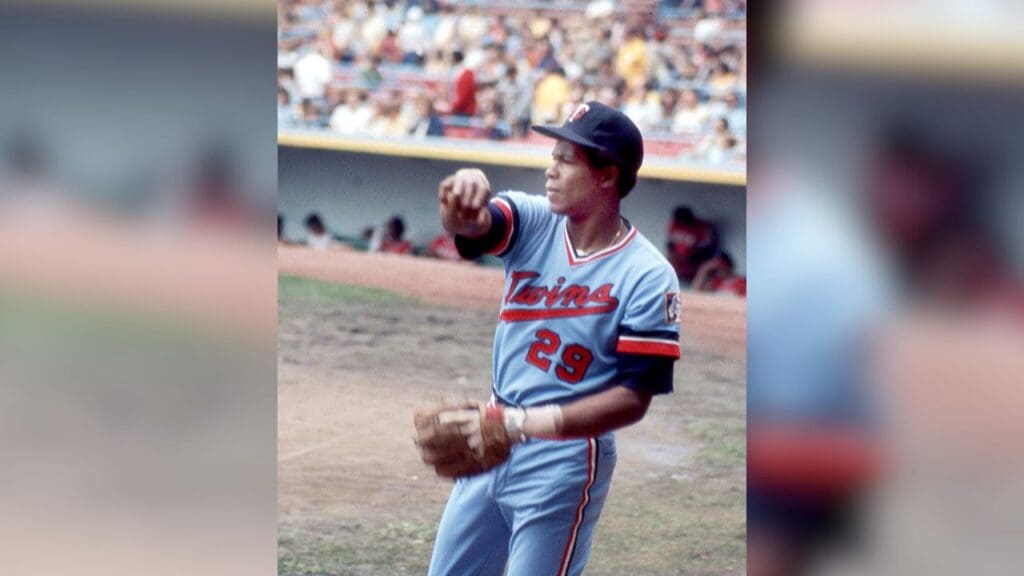
Another team that needs to embrace their perfect powder blue history. The Twins’ 80s road uniforms had just the right amount of pinstripe action, bold lettering, and classic vibes. Minnesota’s current uniforms are fine, but these were better.
4. Arizona Diamondbacks (1998 Purple and Teal Look)
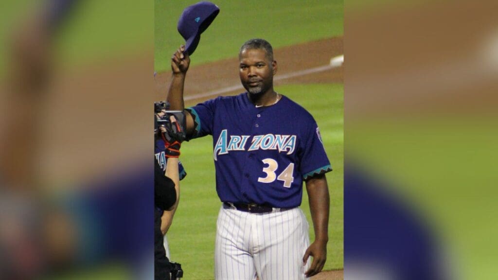
The Diamondbacks’ original purple and teal uniforms were so good, and for some reason, they abandoned them for dull red and black. Arizona fans love their original look—it’s time to make it the main uniform again.
3. Florida Marlins (Teal & Black from the 90s)
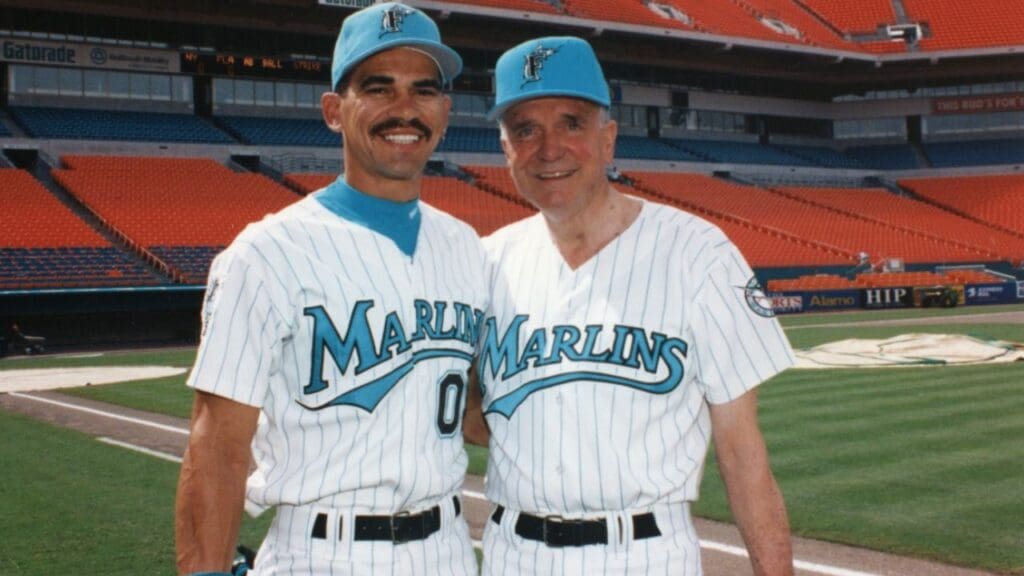
The Marlins’ original look was perfect. The teal caps, the pinstriped jerseys, the sleek black accents—it all worked. Instead of going full “Miami Vice” with their branding, they should just go back to what already looked amazing.
2. Atlanta Braves (1970s “Pac-Man” Jerseys)
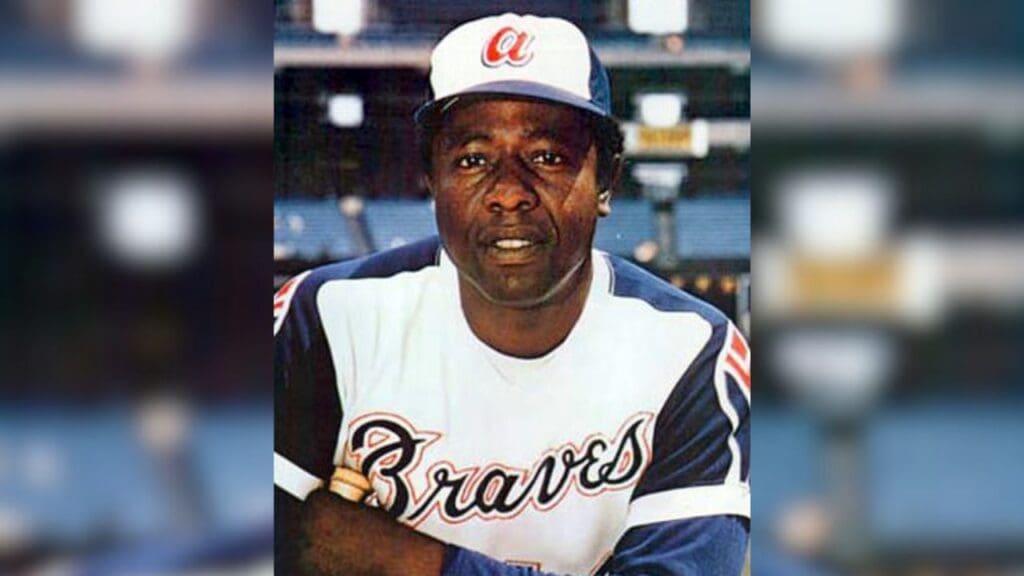
The Braves’ 70s royal blue and white jerseys with the lowercase “a” logo were iconic. They looked sharp and totally unique compared to their current traditional look. If Atlanta wants to mix things up, this is the way to do it.
Related: The Most Iconic Athlete from Every U.S. State
1. Montreal Expos (Because They Need to Exist Again)
Okay, so the Expos don’t exist anymore—but they should, and when they come back (manifesting it), they have to bring back their baby blue, red, and white uniforms. The tri-color cap? The beautiful Expos logo? Absolutely timeless.
Related: The 15 Most Iconic MLB Ballparks of All Time, Ranked